Chef.me
- A mobile app that helps college students meal plan with budget and diet-friendly recipes.
Project Type
Individual Project
Academic Project
Role
Project Researcher
UX/UI Designer
Duration
6 weeks
Tools
Figma
Dovetail

TABLE OF CONTENTS
ABOUT CHEF.ME
Chef.me is a meal-planning application that addresses issues that college students face when preparing meals to eat throughout the semester. College students are the target demographic because of higher time constraints in studying and social life and monetary issues, making budget options necessary.
Chef.me was a project for a graduate course: "Interaction Design Studio," which featured two projects throughout the course and a weekly critique session of the research and deliverables that students made for each step.
The problem that college students face in meal planning affects their nutrition, financial burdens of relying on takeout, and wasted food if ingredients aren't used properly.
The solution in mind was a meal-planning application that provided recipes and an opportunity for students to quickly add recipe ingredients to an automated grocery list. With an effective meal planning application suited to their needs, students can manage their time better by preparing meals more easily, giving them more time and motivation to study.
The project's process consisted of market research, user research in the form of interviews, personas and storytelling, and wireframing/prototyping, all critiqued by my professor and three other classmates during in-person sessions.
MARKET RESEARCH
HelloFresh
HelloFresh is a meal kit delivery service that sends a recipe and a box of ingredients to the user’s door. The user can view recipes on the application, and then order them to their house with the exact ingredient units to prepare the meal.
HelloFresh Strengths
1
Sustainability
HelloFresh's commitment to sending exact units of ingredients helps reduce food waste.
Learnability
2
Clear instructions help users learn how to cook the meals simply and efficiently.
Delivery
3
Helps users decrease time while shopping by having all the ingredients shipped directly to their door.
HelloFresh Weaknesses
High Cost
1
HelloFresh plans start at $9.99 per serving, plus a $10.99 shipping fee per week, making it less feasible for students on a budget. While the price is due to the convenience of the product, some users tend to find that it’s not worth the price.
Dietary Restrictions
2
Some people have specific dietary restrictions that HelloFresh meals do not meet.
HelloFresh Usability Issues
1
Lack of Diet Filter
There is no filter option to choose the type of diet (e.g. Vegetarian, Ketogenic, Kosher, Halal, etc.) It does let the user choose by cuisine/ingredients though.

The feedback on how long the user wants to prepare the food is hard to see, especially if both thumbs are on the screen.

2
Visibility
Whisk
Whisk is an AI-powered application that helps users plan meals and create recipes. It also takes human-made recipes and lets users save them to their profiles.
Whisk Strengths
1
Planning
Whisk features a planning section to track recipes and schedule them.
2
AI Recipes
Unique method of tailoring data in the app directly to user preferences and their available ingredients.
3
Organization
There are preferences to save recipes, organize them into folders, and then place them into time slots in the planner.

Whisk Weaknesses
No Cuisine Choices
Whisk does not allow users to filter between different cuisines (e.g. Mexican, Chinese, etc.) which most food applications have as a standard.
AI is Unpredictable
AI usually tells the user what they want to hear, and it’s not guaranteed that the recipes are good because the AI cannot taste anything.
Buggy
1
2
3
There are usability issues that affect the functionality of the application. One is shown in the image to the right.
Whisk Usability Issues
1
Cannot Sign in with Google
After a few minutes of reviewing the application, there was a bug where the pop-up to sign in with Google would close as soon as it showed up.
2
Unnecessary Features
The list feature is just for shopping lists, which can be done on a Notes app.
Mealime
Mealime is a meal planning helping application which provides different recipes for users, and also transfers the ingredients to a list to help users know what to buy.
Mealime Strengths
1
Sustainability
Mealime sets up grocery lists based on the exact amounts of ingredients.
2
Filtering
Diverse options of cuisines, diets, and dish types that provide the user with variety.
3
Cost-efficient
A majority of the servings in the meals in this application are not costly.

Mealime Weaknesses
1
No Calendar
More recipe-focused, less meal planning (no planning or scheduling feature)
Market Research Summary

Key Takeaways
1
Sustainability
Grocery lists to make sure the user knows exactly what they need.
2
Learnability
Easy-to-understand user interface and recipes for beginner cooks to avoid stress and frustration.
3
Filtering
Make sure the filters contain a diverse amount of cuisines and dietary restriction options.
4
Time Management
Allow users to plan meals within the application ahead of time.
USER RESEARCH & ANALYSIS
Interview Analysis
To understand the issues that college students typically face in preparing their meals during the academic year, I conducted semi-structured interviews with four students with varying cooking experience levels and eating habits. My questions revolved around four main topics: eating habits & struggles, where they find and buy recipes & groceries, and online food resources.
Participants
Participant A
Participant B
Participant C
Participant D
Each interview was around fifteen minutes, and in the future, I would strive to utilize more follow-up questions to gather more information on which to base the project. Still, with the information from the interview, I organized essential points into several topics by conducting a thematic analysis on the website Dovetail. Dovetail is a transcription analysis program similar to nVivo, which I have used previously, but I vastly prefer Dovetail's user flow. Dovetail lets the user upload a transcribed document of an audio recording, highlight important sentences, organize them into tags, and group them under larger insights.
Group 1: Meal Planning Obstacles
Environmental Limitations
The interviews' common themes were social interactions and experiences with gender-based discrimination, intimidation and doubts, and notifications pushing them to search for careers.
Time Management
The interviews' common themes were social interactions and experiences with gender-based discrimination, intimidation and doubts, and notifications pushing them to search for careers.
Group 2: Takeout
Influences to order takeout
The interviews' common themes were social interactions and experiences with gender-based discrimination, intimidation and doubts, and notifications pushing them to search for careers.
Group 3: Food Resources
What users like and want
The interviews' common themes were social interactions and experiences with gender-based discrimination, intimidation and doubts, and notifications pushing them to search for careers.
Summary of Insights
1
Chef.me needs to account for different cooking skills, budgets, and living environments when centering around college students.
2
Chef.me needs to be designed around convenience to keep students motivated to meal plan and cook.
3
Chef.me should implement filters based on cooking experience, diets, cuisines, etc. to make helpful recipes.
USER PERSONAS & STORYBOARDS
The user personas consist of user traits, goals, frustrations, and demographics. My primary goal was to describe the users' lives even without the description.
User Persona #1: Isabel

Isabel's Storyboard: Isabel's Issues with Mistranslations/Miscommunication while cooking.
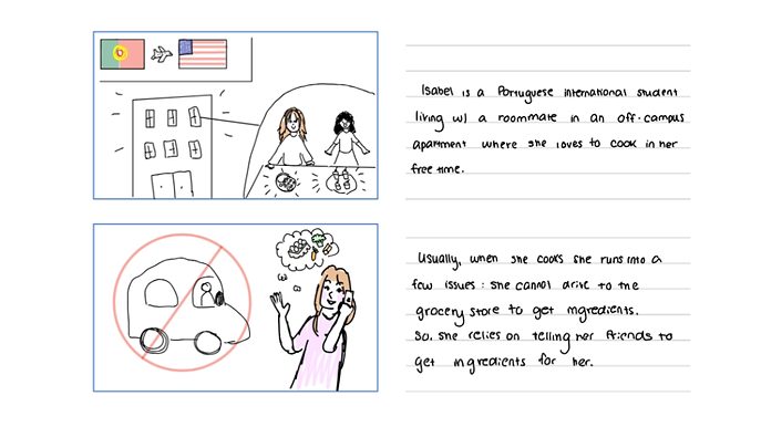
Isabel's Storyboard Part 1
User Persona #2: Ali
![Google UX Design Certificate - Persona [Template] (1).png](https://static.wixstatic.com/media/22c03c_8df51deb2d6344bb9fda8291edb61bc7~mv2.png/v1/fill/w_674,h_377,al_c,lg_1,q_95,enc_avif,quality_auto/22c03c_8df51deb2d6344bb9fda8291edb61bc7~mv2.png)
Ali's Storyboard: Ali's Struggles in Learning How to Cook in a Busy Academic Life.

Ali's Storyboard Part 1
SKETCHES
Sketch #1: Home Page and Grocery List Page

These sketches showcase concepts of the homepage, which includes a person's recipes and other recommended recipes. Additionally, the grocery list showcases meals of the week, and the grocery list with some items checked off.
Sketch #2: Meal plan page and Profile Page

Originally, the sketches showcased the meal plan page separate from other pages and a profile page. After criticism of the homepage concept's appearance, I used the meal plan page as the home page's foundation. Additionally, I felt as if the profile page did not fit the application, so I also got rid of it.
Sketch #3: Filtering Careers/Opportunities

These sketches contain concepts of the recipe page and the most important functions on that page. The second sketch highlights the different filters that the user can use to narrow down recipe results to fit their preferences.
Sketch #4: Filtering Careers/Opportunities

These sketches show a glimpse of the main user flow process on the application where the user can add a recipe into their meal plan. When the user clicks on the floating buttons, they can add the recipe to their meal plan and the ingredients to their grocery list.
LOW-FI WIREFRAMES
Wireframes #1: Navigation Pages

For the home page, changes from the sketch include an added “View Shopping List” button to direct users to the grocery list (also a navigation bar function). Also, a profile page was removed due to the redundancy of features that could be put within the hamburger menu.
The grocery list page features users’ grocery lists based on the meals they added to their meal plan. I also included an aspect in the design that organizes categories of foods/ingredients to streamline shopping based on the shopping aisle in which related items may be located. Changes in the sketch include an added dropdown to hide meals of the week to show more of the grocery list.
The last page is the actual scheduling/meal plan page, where the user can see the meals of the day/week. The "begin cooking" button is an interactive method of following the cooking process for users who like a step-by-step instructional method.
Wireframes #2: Recipe Pages

The recipe page is where users will find recipes that they can add onto their schedule and also automatically add the ingredients to their grocery list. The recipe page includes three tabs that highlight which cookware and ingredients are necessary to make the meal with. Additionally, as one of the design insights specified, the filters page has depth and different categories to benefit users by appealing to specific preferences.
Wireframes #3: Adding a recipe

Adding a recipe is a feature of the recipes page where the user can add their own/family recipes and easily add those to future meal plans. There is a step-by-step process to include ingredients, necessary cookware, and the steps for future use.
HIGH-FI PROTOTYPE [Link]

Home Page
The homepage showcases the user's meal plan, highlighting the current day and week. Buttons lead to other key pages like the grocery and recipe pages. There is an option to share the meal plan to roommates/friends as well.
Grocery List Page
The grocery list is made up of ingredients from recipes that the user saves and organizes them into categories.


Recipes Main Page
Recipes are the place where users search for, filter through, and add their own recipes. It also features saved and popular recipes.
Filtering Recipes Page
If a user has specific preferences, they can use this page to narrow down results.


Recipe Page
The recipe page includes cookware, ingredients, and the step-by-step process to cook the meal. Additionally, users can add it to their meal plan along with the ingredients to their grocery list.
Cooking Help Page
This page is an interactive list/slideshow style step-by-step resource that the user can use when cooking.

A Reflection & Next Steps
Chef.me was a great project experience for me to practice thematic analysis and present my work to a group of people, but also learn auto-layouts and basics of the Neobrutalism design style.
I really like to play around with palettes and make sure that my high-fidelity prototypes function as if it was an actual application, so having so many different types of gesture controls and making sure that the screen would adjust to opening dropdown tabs was a new skill I learned and I believe it reflected well in this prototype.
Some next steps would be to think more intuitively about filling in some of the gaps that the user flow has that might confuse new users. Sometimes I feel like I go over the imperfections of the minor details more thoroughly and miss out on the broader picture that affects the usability.