TourTi is a phone application built to make booking and check-in processes easier through a single, usable platform for people who want to attend art museum tours.
TourTi

MY ROLE
I was the UX designer and researcher while developing an app for TourTi from ideation to delivery. My responsibilities were conducting interviews, paper and digital wireframing, low and high-fidelity prototyping, conducting usability studies, accounting for accessibility, and iterating on designs.
HIGH FIDELITY PROTOTYPE
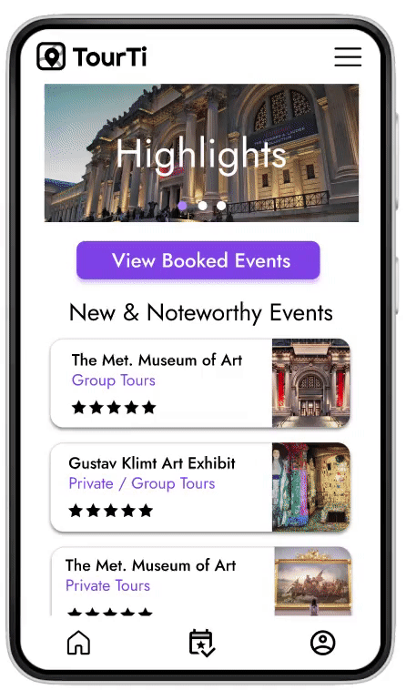

Home and Category Pages
The homepage shows off highlights and popular events to allow the user to start exploring the application's offers. The category introduces more events and filtering and map navigation options.
Event and Profile Pages
The event page introduces the event with an interesting description and concise details all within one page to answer popular user questions. The profile page shows off review posts.


Booking Process Pages
The booking process pages utilize a progress bar for transparency for the user. Choices like the calendar were made for the user to ease their booking process, and the first page confirms the user's chosen details before they continue.
Check Out and
Booked Pages
The checkout page currently only provides two options and takes inspiration from other applications. The final page in the booking process is made to convey the message of completion to the user.


Booked Events and Check-In Pages
Both of these pages concisely state event details and begin the check-in process. The user can access the booked events page through the navigation bar and the button on the homepage.
Check-In Process Pages
The check-in process uses a verification code sent to the user's email or phone number. This is to make a simple digitalized check-in process to avoid lines and misdirection in-person.

UNDERSTANDING THE USER
Due to the nature of the platform, I wanted to focus on a user base of travelers and tourists, ideally ESL, to determine if our application was readable and usable. I created personas and empathy maps to understand the users I’m designing for and their needs.

Lana is an engineer who needs TourTi as a way to book and check-in to art tours during vacation without language barrier troubles.

Creating the user persona and empathy map let me understand how to structure my prototype around the users likely to use TourTi.
THE PROCESS
Ideating for TourTi began with paper wireframes showcasing pages involved in a user's event-booking and checking-in process.
Paper Wireframes

Digital Wireframes and Low-Fidelity Prototyping
I prototyped the digital wireframes and low-fidelity prototypes on Figma, utilizing icons, and lines to represent text, and marked where images would go for further development. The low-fidelity prototype was used for user testing.

Usability Study
I worked on an unmoderated usability study with four people of ranging ages to determine what I needed to change in my low-fidelity prototype. In that process, I saw that the participants found the application usable but encountered some issues that were fixed as the prototype continued to be developed and honed.
Findings
1
Early designs showcased broadly labeled buttons to continue booking, but after the usability studies, I replaced “Book Now” with a more clarifying button label to identify that the process is ongoing.

2
The low-fidelity prototype showcased a poorly fleshed-out Payment page, that was altered after the usability study to fix the “Pay with Credit” button and appropriately design the fill-in boxes for said section.

3
Users seemed to want a positive affirmation and response for their actions, hence it was concluded at the end of the booking and check-in process along with a confirmation of the event details to keep the user aware.

REFLECTION & NEXT STEPS
Throughout the project, I experienced a thorough run-down of the UX ideation, research, and designing process. It helped me gain more insight into what professionals do in their workplaces. The creation of this project was made for the Google UX/UI certification course on Coursera.
In the second round of testing, users expressed their interest in the idea of the virtual-check in idea and the focus of the application, and it appealed to travelers and local attraction enthusiasts, who liked specific design choices.
"I think the application details throughout the booking process to confirm my choices were really good and made me more comfortable"
In the future, I would like to implement QR codes and research how to fit them into the check-in process that we currently have set up. It will mimic industry standards for those uninterested in the virtual check-in process.